legend('leg1','leg2','Location','NorthWest'); % hide the legend box legend boxoff % set the color of the legend is done via latex grammar legend('\color{red}leg1','\color{blue}leg2'); % use RGB color value in legend legend('\color[rgb]{1,1,0}');
depend on how many lines you plot in a figure;
Legend relative position
1 2 3 4 5 6 7 8 9 10
figure(); sub(1)=subplot(2,1,1); plot(x1,y1); leg(1)=legend('f1'); sub(2)=subplot(2,1,2); plot(x2,y2); leg(2)=legend('f2'); % control the relative position of legend in whole figure leg(1).Position=[x1,y1,dx1,dy1]; leg(2).Position=[x2,y2,dx2,dy2];
Font size
change the fontsize of x,y label at the same time.
1
set(gca,'fontsize',15)
Display minor ticks
1 2 3 4
% show minor tick on x axis set(gca,'XMinorTick','on'); % show minor tick on y axis set(gca,'YMinorTick','on');
Linewidth
1
set(gca,'LineWidth',2);
Display Latex symbols
1 2 3 4
% in xlabel, ylabel and title, you can use latex code directly xlabel('\frac{\pi x^2}{\sqrt(y+3)}'); % but for legend, the case is a little different, you should use cell, $$ symbol and 'interpreter' legend({'$\frac{\pi x^2}{\sqrt(y+3)}$'},'interpreter','latex'));
Use log scale axis[1]
1 2 3 4 5 6
figure() plot(x,y); % set the x axis as log scale, same operation for x axis set(gca, 'YScale', 'log'); % to convert it back to normal axis, you can use linear scale set(gca, 'YScale','linear');
stem plot[2]
stem(x,y) could plot the discrete signals like grass. Its very convenient to display the amplitude of the signal. eg:
1 2 3
x=0:0.1:1; figure(); stem(x,sin(x));
fig operation
A figure plotted with matlab can be saved as a .fig figure file. But .fig file actually contains an structure that has objective characters.
If the figure is a plot of many subplots, the process to extract its data is even more complicted.
eg. subplot(2,1,:)
1 2 3 4 5 6 7 8 9
clear all;close all;clc; subdata=openfig('data_subplot.fig'); x1=subdata.Children(1).Children.XData; y1=subdata.Children(1).Children.YData; x2=subdata.Children(2).Children.XData; y2=subdata.Children(2).Children.YData; figure() plot(x1,y1,x2,y2); title('extracted data from subplot fig file');
If the lines in a subplot are more than one, the basic Children of this figure object shall be more complicated. However, the procedure to extract them shall be the same. eg:
text(x0,y0,‘text’);
This method aims to add comment to the axis object so that is can be used freely in the subplot. While annotation only fit the the figure object, it does not fit to be used in subplot.
Get figure objects
gca: get current axes object
gcf: get current figure object
% test colorbar position clear all;close all;clc; x=linspace(3,5,200); y=sin(x); % text annotation to a specific data point fig1=figure(); x0=3:0.01:4; y0=cos(x0); plot(x0,y0,'-*'); text(x0(50),y0(50),'test','Color','red'); % text annotation to a relative position on figure figure(); fig1=subplot(2,1,1); plot(x,sin(2*pi*90*x)); set(gca,'fontsize',15,'linewidth',1.5); text1=annotation('TextBox',[0.2,0.8,0.05,0.05],'String','(a)','FontSize',15,'Color','blue','EdgeColor','none'); fig2=subplot(2,1,2); set(gca,'fontsize',15,'linewidth',1.5); ax2=plot(x,x); text2=annotation('TextBox',[0.2,0.4,0.05,0.05],'String','(b)','FontSize',15,'Color','red','EdgeColor','none');
set position of subplot and colorbar
You can control the position of every figure via changing the position of the fig objects.
1 2 3 4 5 6 7 8 9 10 11 12 13 14 15 16 17 18
% test colorbar position clear all;close all;clc; x=linspace(0,1,100); y=sin(x); figure(); fig1=subplot(2,1,1); plot(x,y); bar1=colorbar(); % hide the value tick on colorbar set(bar1,'XTickLabel',[]); legend('sub1'); fig2=subplot(2,1,2); plot(x,x); legend('sub2'); % fig.position=[x0,y0,dx,dy] fig1.Position=[0,0.5,0.5,0.5]; bar1.Position=[0.5,0.5,0.2,0.5]; fig2.Position=[0.5,0,0.5,0.5];
% custom my colormap for spectrum display mymap=zeros(7,3); mymap(7,:)=[139,000,000];% dark red mymap(6,:)=[255,000,000];% red mymap(5,:)=[255,127,000];% orange mymap(4,:)=[255,255,000];% yellow mymap(3,:)=[000,255,000];% green % mymap(3,:)=[000,255,255];% cyan 青色 mymap(2,:)=[000,000,255];% blue mymap(1,:)=[255,255,255];% white % normalize the color map RGB values to within [0,1] mymap=mymap/255;
After this kind of setting, you can use this colormap directly via the command: colormap(mymap). Notice the order the colormap is from up to down in the array. You can even use 2D interpolation to make the colormap more dense.
Appendix: matlab default color names and related RGB values
1 2 3 4 5 6 7 8
Black 000 黑 Blue 001 蓝 Cyan 011 青 Green 010 绿 Magenta 101 紫红 Red 100 红 White 111 白 Yellow 110 黄
You can set different colormaps with different colorbars in subplot. This operation only fit to the new version > 2015R. In the new version matlab, you can use set(gca, colormap_n) to control the colormap of each subplot. And the colorbar will automaticly change along with it.
Change the colors of x,y Ticks
1
set(gca,'xcolor','red','ycolor','green');
Avoid the Axis Tick label overlap
There is no immediate miracles to solve this problem. You can only solve it by adjust the ylim range manually.
figure() plot(x,y,'--green'); plot(x2,y2,'color',[1,0,0],'LineStyle','--'); ``` The default color names in matlab. For the other colors, you can call them via specify the related RGB values. ```matlab % line styles '-' Solid line (default) '--' Dashed line ':' Dotted line '-.' Dash-dot line % line marker styles '+' Plus sign 'o' Circle '*' Asterisk '.' Point 'x' Cross 'square' or 's' Square 'diamond' or 'd' Diamond '^' Upward-pointing triangle 'v' Downward-pointing triangle '>' Right-pointing triangle '<' Left-pointing triangle 'pentagram' or 'p' Five-pointed star (pentagram) 'hexagram' or 'h' Six-pointed star (hexagram)
% add an arrow in figure hold on Ar1= annotation('arrow'); Ar1.X=[0.37,0.65]; Ar1.Y=[0.42,0.48]; Ar1.LineWidth=2; Ar1.LineStyle='--'; Ar1.Color='red';
The above code controls the relative position of the arrow.
Control the length and boldness of the ticks
1
2
3
4
% change TickLength of current axis, former is minor TickLength, later is major TickLength set(gca,'TickLength',[0.03,0.06]); % change the Tick width of current axis set(gca,'LineWidth',1.5);
control the figure boarder[6]
1 2 3 4
% show figure black border set(gca,'box','on'); % hide figure black border set(gca,'box','off');
Set colorbar display range
You can set xlim and ylim via caxis([low, high]) manually.
Add transparent block highlight[7][8]
1 2
hold on ha = area([51, 164],[30,30],'FaceColor','red','FaceAlpha',0.1,'Edgecolor','none');
The two parameters in area [x1,x2],[y1,y2] defines the position of color block, while the FaceColor determines the color type, FaceAlpha defines tranparence, Edgecolor defines boarder color。
Add verticle lines
1 2 3 4
t2=3.3; t3=4.8; hold on line([t3,t2],[0,100],'Color',c3,'LineStyle','-.','LineWidth',2);
This can be set by the line function, first parameters set x range,second set y range。You can even set the array with plot.
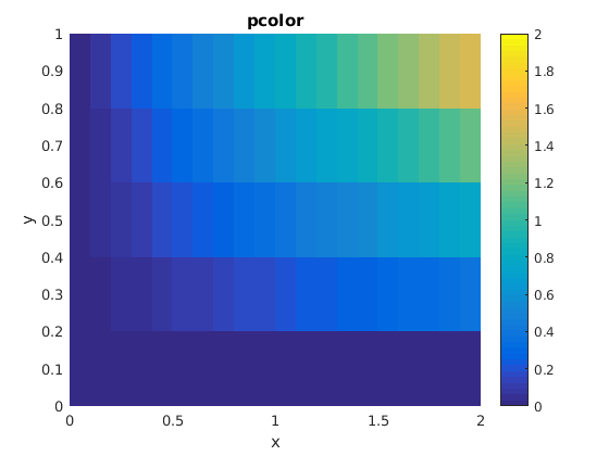
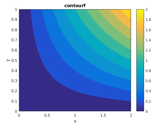
Adjust contour plot colormap range
To get similar color effect. First you need adjust colormap background value. Then you need to adjust the maximum color value.
Set grid on
1 2 3 4 5 6 7 8 9 10 11 12 13 14 15 16
% test grid line style control
clear all;close all;clc;
x=0:100;
y=sin(0.1*x);
figure('Position',[0,0,600,500]);
plot(x,y);
xlabel('x');
ylabel('y');
title('test grid style');
grid on;
set(gca,'FontSize',15,'Linewidth',1.5);
set(gca,'XMinorTick','on','YMinorTick','on');% control on/off of minor grids
set(gca, 'xminorgrid', 'on','YMinorGrid','on');% control on/off of minor grid lines
set(gca,'MinorGridLineStyle',':');% set minor grid line style
set(gca,'GridLineStyle','--');% set major grid line style
set(gca,'GridAlpha',0.3);% set grid line transparence